How to Use GPT Image 2: A Practical Guide with 12 Hands-On Examples
GPT Image 2 is OpenAI's state-of-the-art image generation model, released April 21, 2026. It is the recommended default for any new image workflow: highest-quality generation and editing, near-perfect multilingual text rendering, identity-sensitive edits, and flexible sizing up to 4K. This guide is a practical, prompt-first walkthrough — how to phrase the prompt, what to ask for, and twelve real examples you can copy directly.
The twelve prompts below all follow OpenAI's recommended prompt structure. Copy them, swap the subject for your own, and ship.
The Prompt Recipe That Actually Works
GPT Image 2 rewards structure. The model is significantly better at following prompts written as a clear sequence of directives than free-form sentences. Every example below uses the same recipe — six elements in this order:
- Scene / background — where the image takes place ("a sun-bleached stone terrace overlooking the Mediterranean").
- Subject — who or what is in the frame, including scale, pose, gaze, and action ("a tall woman in an oversized cream linen suit, gaze slightly downward").
- Key visual details — materials, textures, fabric, surface ("matte black kraft paper with a natural linen texture stripe").
- Composition and camera — framing, viewpoint, perspective, focal length ("medium close-up at eye level, 50mm lens, shallow depth of field").
- Lighting and mood — direction, quality, time of day ("soft diffused window light from the upper left, golden hour rim light").
- Constraints — what to preserve, what NOT to add ("no watermark, no extra text, preserve identity and layout").
Two extra rules to remember: put literal in-image text in quotes ("RUN FASTER.") and include the word "photorealistic" explicitly when you want a real-photo look. Generic style tokens like "8K, ultra-detailed, masterpiece" are mostly leftover patterns from earlier diffusion models — GPT Image 2 largely ignores them. Spend that prompt budget on lighting, composition, and constraints instead.
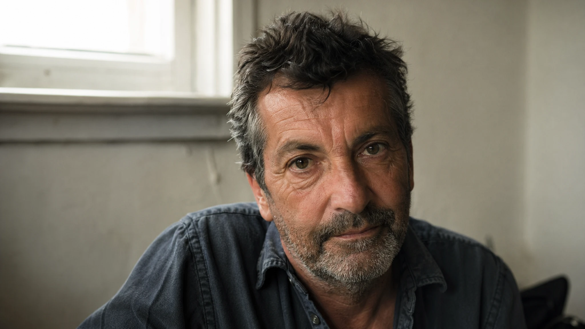
Example 1 — Photorealistic Portrait with Real Skin Texture
Portraits are the most identity-sensitive category in image generation. The trick with GPT Image 2 is to avoid words that imply studio polish ("perfect skin," "flawless," "professional retouching") and instead ask explicitly for real-photo cues: pores, fine lines, asymmetry, available light. Use the high quality setting and a square or portrait aspect ratio for the cleanest results.
Prompt
A photorealistic candid portrait of a man in his late 50s, weathered skin with visible pores and sun lines, short salt-and-pepper beard, calm direct gaze. Soft diffused window light from the upper left, warm neutral wall behind him slightly out of focus. Medium close-up at eye level, 50mm lens, shallow depth of field, subtle film grain, natural color balance. Honest and unposed, real skin texture, no glamorization, no heavy retouching. No watermark.
Why this works: the prompt names the medium (50mm, shallow depth of field), the lighting direction (upper left, soft diffused), and the specific anti-cues ("no glamorization, no heavy retouching"). Those constraints push the model away from the generic AI portrait look.
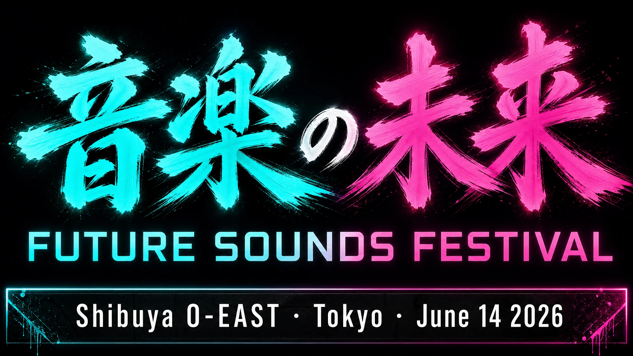
Example 2 — Multilingual Poster with In-Image Text
Text rendering is GPT Image 2's breakout capability. The model uses a typographic pathway that lays glyphs as vectors before rasterizing them — which means English, Japanese, Korean, Arabic, Chinese, and Hebrew all render correctly on the first try in most cases. Quote your literal copy, name the typeface family ("bold geometric sans-serif"), and call out placement.
Prompt
A bold music festival poster, vertical orientation. Headline in large brushstroke kanji centered at the top third: "音楽の未来". Directly below in a clean geometric sans-serif: "FUTURE SOUNDS FESTIVAL". Bottom strip in smaller white type: "Shibuya O-EAST · Tokyo · June 14 2026". Dark background, electric teal and magenta neon glow. All text must be fully legible and correctly formed. No decorative elements that obscure the type. No watermark.
Tip: for tricky brand names or uncommon spellings, spell them out letter-by-letter inside the prompt ("F-U-T-U-R-E"). This boosts character accuracy when the word is unusual or contains numbers.
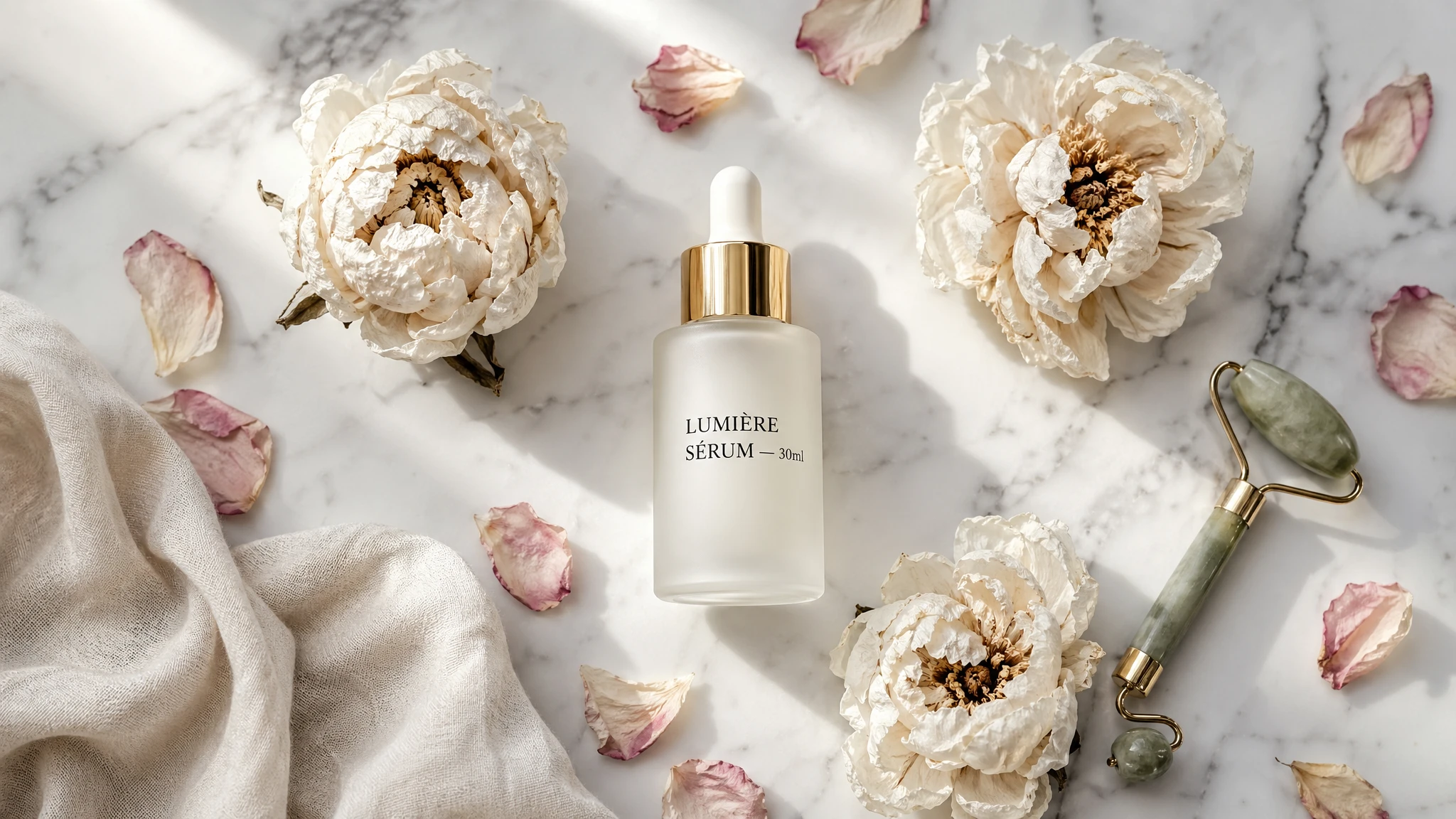
Example 3 — Product Photography with Readable Label
Product photography is where GPT Image 2 directly replaces studio shoots for a wide range of e-commerce SKUs. The pattern below works reliably: name the surface and lighting first, then the product geometry, then the literal label copy in quotes, then composition and framing. Keep the high quality setting for label legibility.
Prompt
A high-end skincare flat lay on smooth white marble. Center: a frosted glass serum bottle with a gold dropper cap. The label reads "LUMIÈRE SÉRUM — 30ml" in clean black serif type. Surrounding it: three dried white peonies, scattered rose petals, a small jade facial roller, and a cream-colored linen cloth crumpled in the bottom-left corner. Soft north-window light from above-left, clean drop shadows under each object. Shot from directly above. Magazine-editorial feel, not studio-staged. No watermark, no extra text.
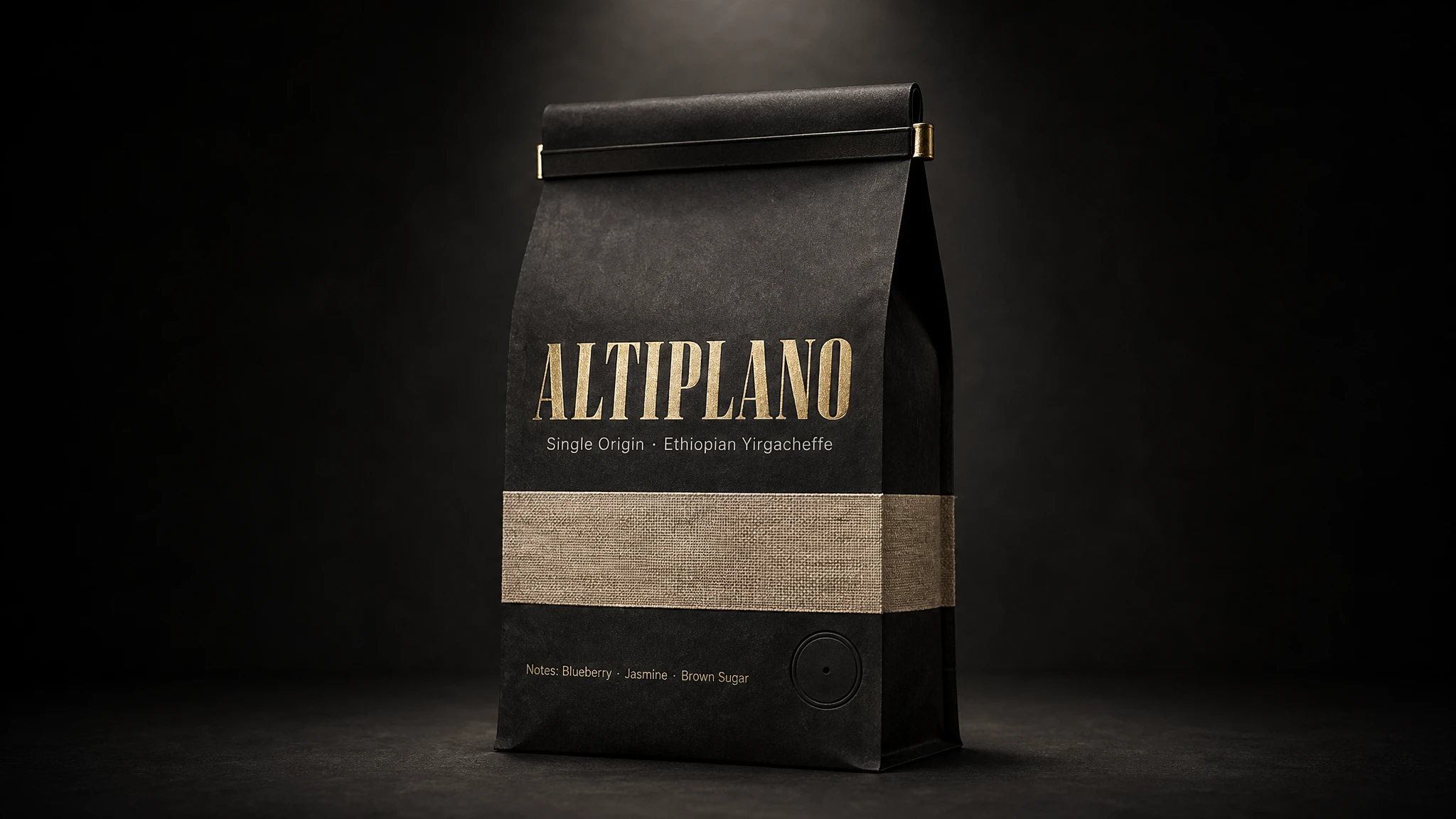
Example 4 — Packaging Mockup with Brand Integrity
Packaging mockups need text rendered correctly across a 3D surface with curved distortion and material texture. This used to be impossible without Photoshop compositing. With GPT Image 2 it is one of the highest-leverage use cases: ingredient panels, tasting notes, and brand typography all render legibly on the first pass for most prompts. List every text element you want to appear, in the order it should appear.
Prompt
A photorealistic standing coffee bag mockup. The bag is matte black kraft paper with a natural linen texture stripe across the center. Brand name on the front: "ALTIPLANO" in bold wide uppercase serif, letterpressed in gold foil. Below it: "Single Origin · Ethiopian Yirgacheffe" in a smaller clean sans-serif. Bottom strip: "Notes: Blueberry · Jasmine · Brown Sugar". Tin-tie closure at the top, circular degassing valve on the lower right. Dark studio background with a single dramatic spotlight from above. Realistic paper texture, no plastic sheen.
For brand-sensitive packaging, lock the high quality setting and run two or three regenerations of the same prompt. GPT Image 2 will produce slight variations between runs — pick the one whose typography is cleanest, the rest of the elements will already be on-brief.
Example 5 — Marketing Ad Creative with Verbatim Headline
Treat marketing prompts as creative briefs, not technical specs. Describe the brand, audience, vibe, scene, and exact tagline. Quote the literal copy and add "EXACT, verbatim, no extra characters" so the model does not paraphrase. Specify placement ("right panel," "centered," "below the product") so layout stays predictable across reruns.
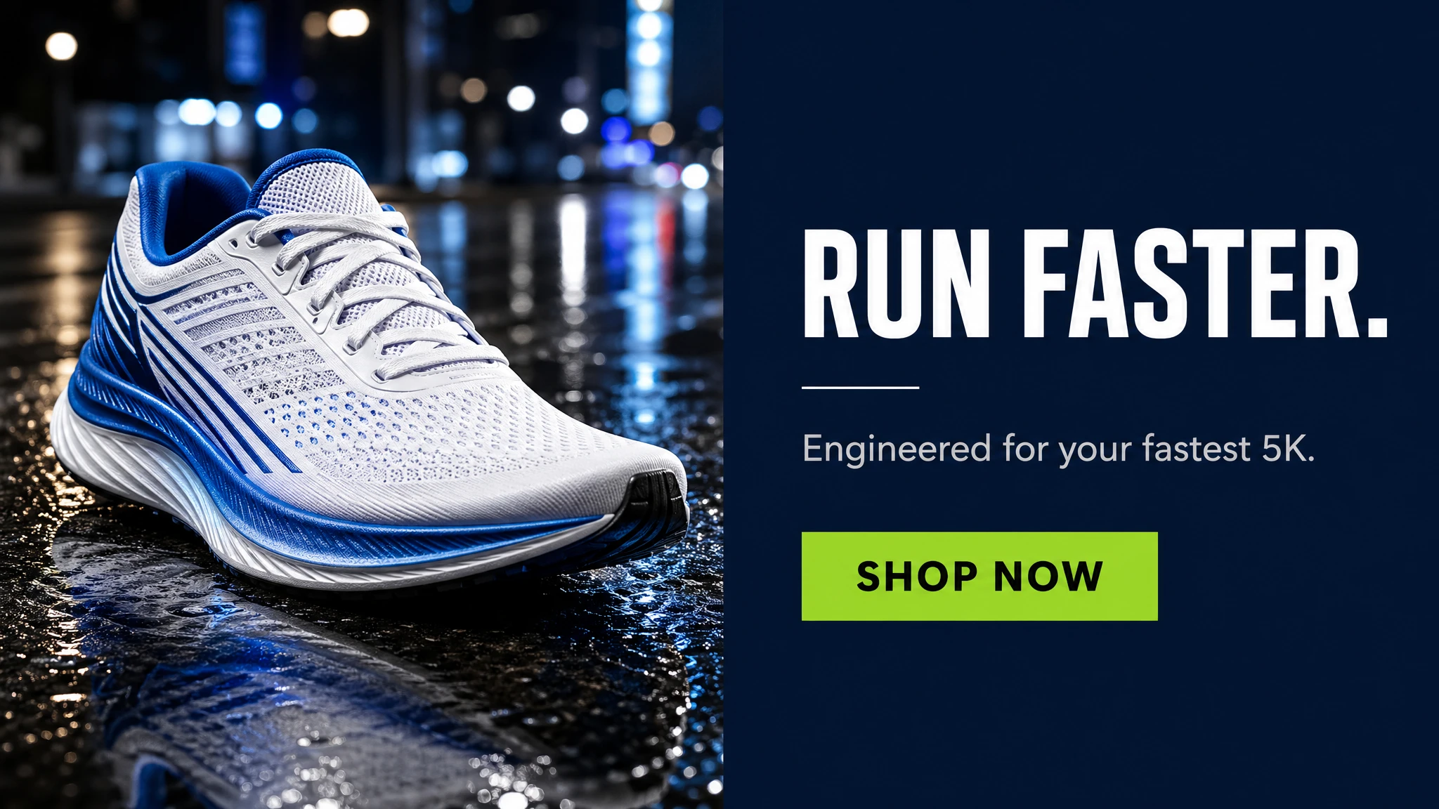
Prompt
A clean social media ad for a premium running shoe brand. Split layout: left half shows a dramatic close-up of a white and electric blue running shoe on wet asphalt reflecting city lights. Right half is a solid dark navy panel. On the navy panel, stacked vertically: bold white headline "RUN FASTER." (EXACT, verbatim, no extra characters), a small white separator line, then secondary copy in light grey "Engineered for your fastest 5K." then below that a solid lime green CTA button with the text "SHOP NOW" in black. Modern, premium athletic aesthetic. No watermark, no extra text outside the elements above.
Example 6 — Infographic with Arrows and Labels
Infographics combine three hard things at once: typographic hierarchy, iconography, and data accuracy. GPT Image 2 handles the first two reliably for stylized educational diagrams. For each step or section, list it explicitly in the prompt — number, title, icon, and one-line description. Use a landscape size and the high quality setting for dense layouts.
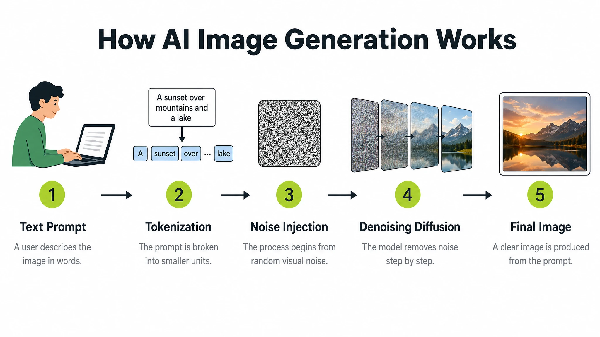
Prompt
A clean modern educational infographic titled "How AI Image Generation Works" showing 5 steps in a left-to-right horizontal flow. Step 1: "Text Prompt" — icon of a person typing. Step 2: "Tokenization" — text split into tokens. Step 3: "Noise Injection" — abstract Gaussian noise cloud. Step 4: "Denoising Diffusion" — blurry image sharpening. Step 5: "Final Image" — completed photograph. Each step has: a bold number in a lime green circle, a flat icon above, the step title in bold dark text, and a one-line description in grey below. Steps connected by clean horizontal arrows. White background. Clear typographic hierarchy. No decorative clutter, no extra text.
For data-heavy infographics where numbers must be accurate (market sizing, scientific values), include the literal numbers in the prompt. The model will not invent figures — it will render the values you supply as-is.
Example 7 — UI Mockup as a Real Shipped App
UI mockup generation is a new use case that GPT Image 2 handles better than any prior model. The trick: describe the product as if it already exists. Avoid concept art language ("dreamy interface," "futuristic UI"). Focus on layout, hierarchy, spacing, and real interface elements so the result reads as a usable app, not a design sketch. List every UI section in order.
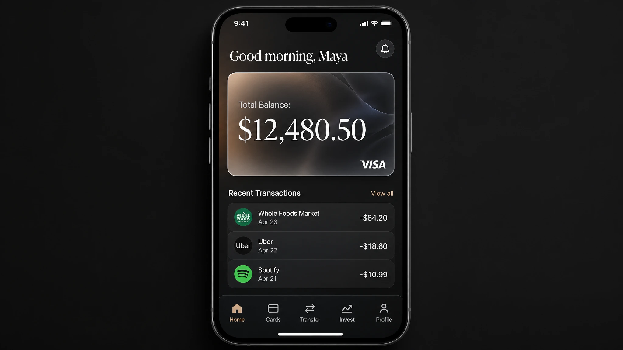
Prompt
A photorealistic mobile app UI mockup for a premium digital bank, placed in an iPhone frame. Dark charcoal background. Top: user greeting "Good morning, Maya" in white. Below: a frosted glass card showing "Total Balance: $12,480.50" in large white serif, with a small visa logo bottom-right. Below the card: a section "Recent Transactions" with three rows — each row has a category icon left, merchant name and date center, and amount right (e.g. "Whole Foods Market · Apr 23 · -$84.20"). Bottom navigation bar with five icons: Home, Cards, Transfer, Invest, Profile. All labels must be legible. Clean, minimal, premium fintech aesthetic. No watermark.
Example 8 — Logo Generation with Multiple Variants
When you need to explore a brand mark, ask the model for a batch of variants from the same prompt — most GPT Image 2 surfaces let you set a "number of variants" option that returns four (or more) takes on the same brief in one go. Useful for stakeholder review and exploratory branding work. Keep the prompt simple: name the brand, the personality, and ask for clean shapes, balanced negative space, and scalability.
Prompt
Create an original, non-infringing logo for a company called "Field & Flour", a local bakery. The logo should feel warm, simple, and timeless. Use clean vector-like shapes, a strong silhouette, and balanced negative space. Favor simplicity over detail so it reads clearly at small and large sizes. Flat design, minimal strokes, no gradients unless essential. Plain background. Single centered logo with generous padding. No watermark.
Tip: when generating multiple variants, charge the prompt with one taste-driven adjective ("warm," "industrial," "playful") instead of dictating shape. The model will explore in the direction of that adjective and the four outputs will feel like coordinated alternatives rather than random variations.
Example 9 — Multi-Panel Story with Character Consistency
GPT Image 2 supports multi-panel storytelling in a single generation: define each panel as a clear visual beat and the model maintains character appearance, clothing, and visual style across all panels in one image. This works for comic strips, storyboards, sequential brand campaigns, and children's book illustration. Describe the protagonist once at the top, then list each panel as a numbered beat.
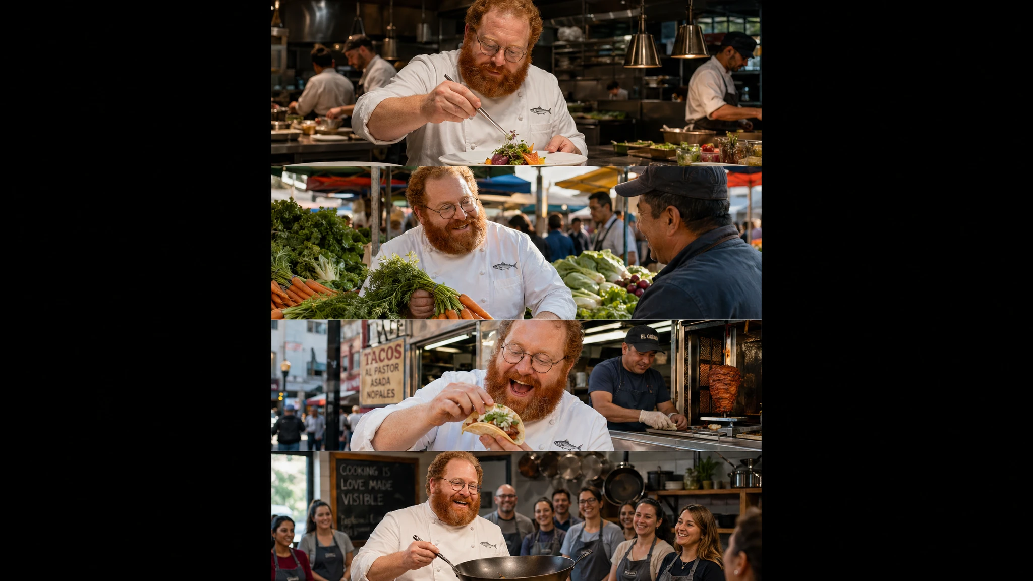
Prompt
A vertical comic-style image with 4 equal-sized panels. Same character throughout: Chef Milo, a cheerful stocky man in his 40s with a thick red-orange beard, round wire-rimmed glasses, white double-breasted chef coat with a small anchovy embroidered on the chest pocket. Panel 1: Milo plating a dish with tweezers in a busy open kitchen, intense concentration. Panel 2: Milo at a morning market selecting vegetables, smiling at a vendor. Panel 3: Milo eating a street taco by a food cart, genuine delight. Panel 4: Milo teaching a cooking class, holding a carbon steel wok, students visible in the background. Keep Milo's face, beard, glasses, and coat identical across all four panels. Cinematic photography style.
Example 10 — Natural-Language Editing (Background Swap)
GPT Image 2 supports image editing without masks. Hand the model a reference image and a text instruction, and it applies the change while keeping the rest of the frame intact. The pattern that works best: state explicitly what to change AND what to preserve. Use phrasing like "change only X" + "keep everything else the same" + repeat the preserve list. This dramatically reduces drift on the first attempt.
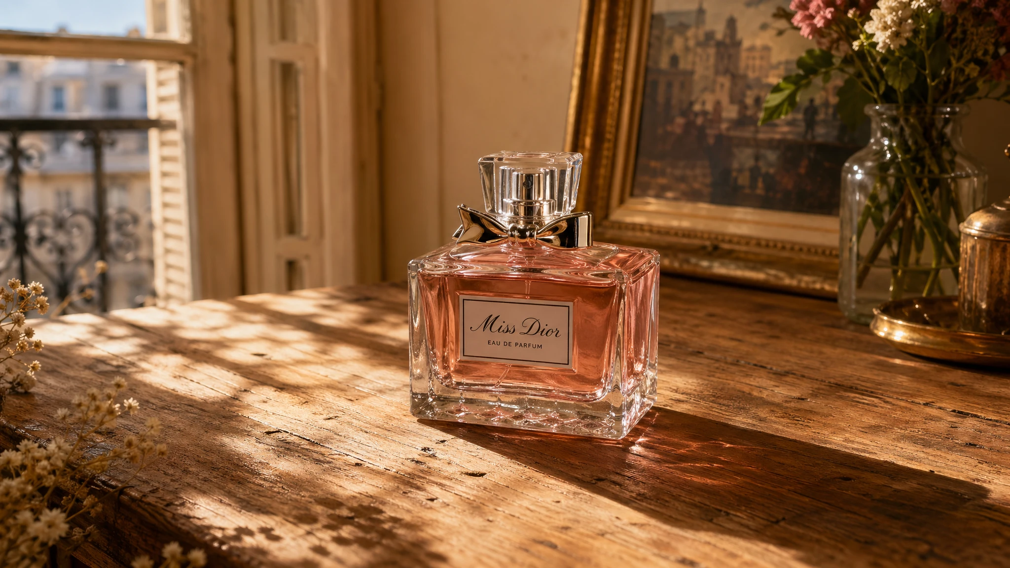
Prompt
Change only the background. Keep the perfume bottle, its label, its reflections, and its shadow exactly as they appear in the input image. New background: a warm rustic wooden table surface with soft dappled sunlight from the upper left, like a sunlit Parisian apartment. Match the lighting direction so the bottle shadow falls naturally on the new surface. Do not change the bottle, do not change saturation or contrast of the bottle, do not add any text or watermark.
Example 11 — Style Transfer from a Reference Image
Style transfer keeps the visual language of a reference image (palette, brushwork, film grain, illustration style) while changing the subject. Drop in the reference, then describe what must stay consistent (style cues) and what must change (new content). Adding a hard constraint like "no extra elements" prevents the model from inventing peripheral details.
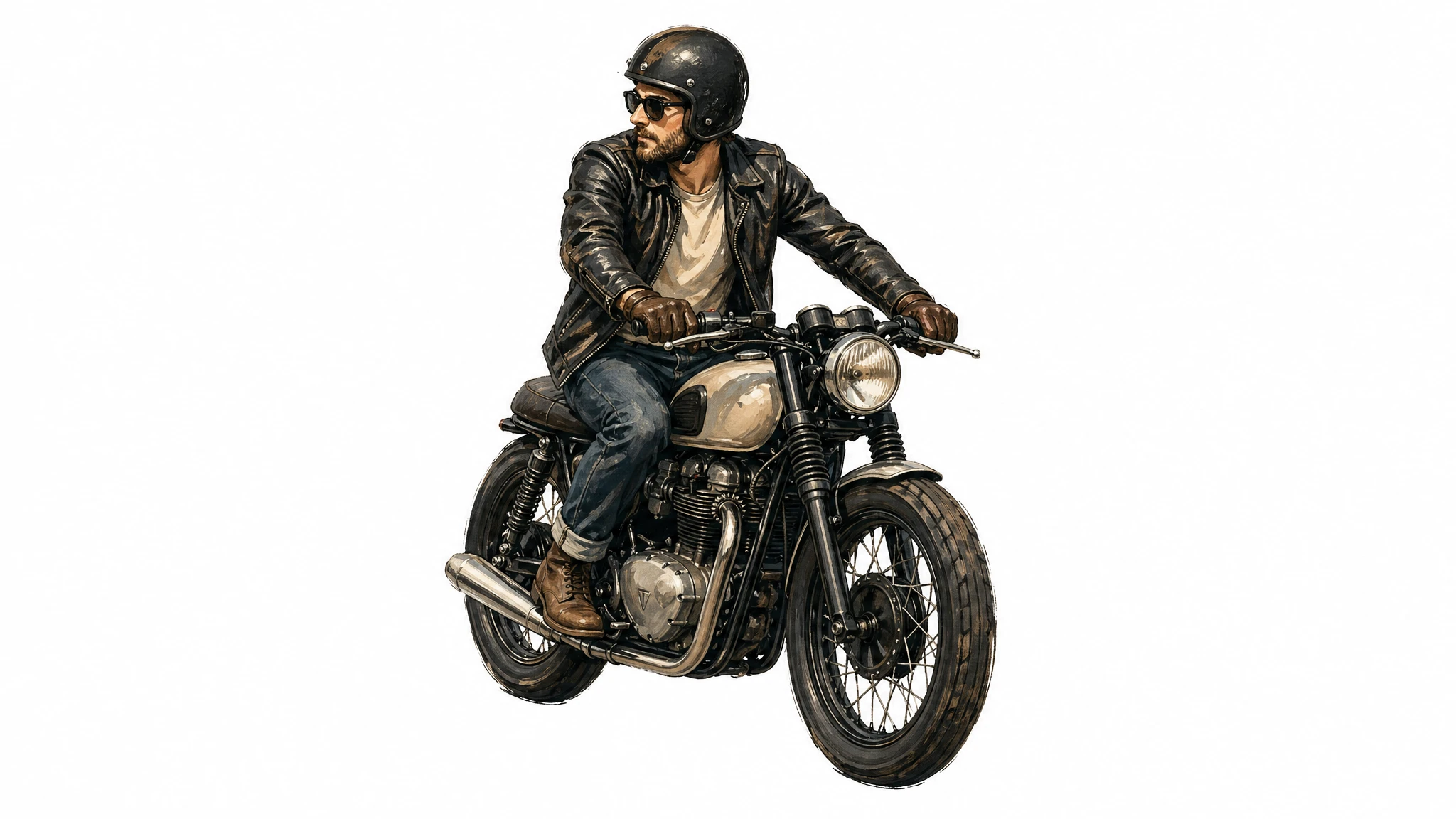
Prompt
Use the same illustration style as the input image — the same palette, brushwork, line weight, and texture. Generate a new subject: a man riding a motorcycle on a plain white background. Keep the visual style identical to the reference. Centered subject, generous padding, no extra elements, no text, no watermark.
Example 12 — Translating Text Inside an Existing Image
In-image translation is one of GPT Image 2's most useful production patterns. Hand the model a finished design — an ad, an infographic, a UI screenshot, a packaging mockup — and ask it to translate the text without changing anything else. The key constraint phrasing: "Translate the text to X. Do not change any other aspect of the image." This preserves typography, placement, spacing, hierarchy, and surrounding imagery.
Prompt
Translate the text in the input image to Spanish. Do not change any other aspect of the image: keep the typography style, font size, placement, spacing, hierarchy, icons, illustrations, color palette, and all non-text elements exactly as they appear. Translate verbatim and accurately, no added words. No reflow unless absolutely necessary. No watermark.
This pattern unlocks an entire localization workflow that previously required design tools. One source asset → one prompt per target language → ready-to-ship localized creative. Verify dense paragraphs at small point sizes — accuracy can drop slightly on very small body copy.
Choosing Quality and Size by Use Case
GPT Image 2 exposes three quality levels — low, medium, and high — and supports flexible sizes from a 1024×1024 square up to a 4K hero. Low is the fastest and is genuinely good for thumbnails, drafts, social previews, and any image that will go through a downstream review step. Reach for medium or high only when fidelity is the bottleneck. The table below maps recommended settings to common use cases.
| Workflow | Recommended Size | Recommended Quality | Notes |
|---|---|---|---|
| Social media draft / thumbnail | 1024×1024 | low | Fastest. Good for batch generation. |
| Product photography (e-commerce) | 1536×1024 | high | Label legibility requires high. |
| Portrait / fashion editorial | 1024×1536 | high | Skin texture and lighting need high. |
| Marketing ad with in-image text | 1024×1024 or 1080×1350 | medium or high | High if dense headline + CTA + body. |
| Packaging mockup | 1024×1536 | high | Multi-line text on 3D surface needs high. |
| Infographic / educational diagram | 1536×1024 | high | Dense labels and legends need high. |
| UI mockup | 1024×1536 | medium | Layout-driven; medium suffices. |
| Logo (multiple variants) | 1024×1024 | medium | Variants from the same prompt; medium balances speed. |
| Multi-panel comic / storyboard | 1024×1536 | medium | Consistency across panels; medium is enough. |
| Background swap / object edit | 1024×1024 or input size | medium | Edits preserve input fidelity automatically. |
| In-image translation | Match input | medium | Layout preservation is the main goal. |
| 4K hero asset | 3840×2160 | high | Experimental; expect more variability. |
Common Pitfalls and How to Avoid Them
- Generic style boosters ("8K, ultra-detailed, masterpiece, cinematic") are mostly ignored. They are leftover patterns from earlier diffusion models. Spend that prompt budget on lighting, composition, and constraints instead.
- Asking for "perfect skin" or "flawless" produces the generic AI portrait look — plasticky, oversmooth, identity-light. Replace those words with explicit real-photo cues: "visible pores," "fine lines," "asymmetry," "available light," "no heavy retouching."
- Vague layout instructions ("make it look nice") lead to inconsistent results across reruns. Spell out positioning ("logo top-right, headline centered, CTA bottom-left") whenever you need predictable placement.
- Forgetting to quote literal text. Without quotes, the model paraphrases. With quotes plus "EXACT, verbatim, no extra characters," it renders the words as written.
- Above 2K (2560×1440), results are flagged experimental — text rendering, fine detail, and prompt adherence become more variable. If you need a 4K hero, generate at 2K first and scale separately.
- Trying to change three or more independent parts of an image in a single edit. Multi-region edits often need 2–3 iterations. Break the edit into sequential single-change passes — you will hit production quality faster.
- Transparent backgrounds are not currently supported. Generate on an opaque background and run a downstream background-removal pass if you need a transparent asset.
- Knowledge cutoff is December 2025. For subjects that emerged after that date — new product designs, 2026 events, recently rebranded companies — the model may produce inaccurate outputs. Provide a reference image when accuracy matters.
Wrap-Up: A Default Prompt Template
If you take one thing from this guide, take the prompt template. It works for almost every use case in the examples above:
Scene → Subject (with scale and gaze) → Materials and texture → Composition (framing, viewpoint, focal length) → Lighting (direction and quality) → Literal in-image text in quotes → Constraints (preserve / no watermark / no extra text).
Start at the medium quality setting and a 1024×1024 square, run two generations to calibrate the prompt, then move to high quality and a non-square aspect ratio for the final asset. For refinements, edit the existing image with a natural-language instruction rather than regenerating from scratch — the latter is the single biggest source of brand drift in production work.